Problem-solving Using Visuals: The Spread of a Rumour
Eva Čoupková is an assistant professor at the Language Centre of Masaryk University in Brno, Czech Republic. She teaches Academic English and English for Specific Purposes for Mathematics and Physics students. Her field of interest is Task-based Learning and Transferable Skills in ESP. Email: coupkova@sci.muni.cz
Introduction
This activity is good for pairs or groups of three to four students. It includes speaking, describing graphs and visuals and subject-specific vocabulary, and can be applied in lessons based on ESP or in general English lessons for students interested in science and data interpretation. I use this activity in my course English for Mathematicians; this course is attended by students of all branches of mathematics whose knowledge of English is usually between B1 and B2 levels of CEFR. As we teach both Academic English and subject-specific terminology, this activity is great as it nicely combines both of these approaches. Discussing graphs and visuals enhances the debating and presentation skills of students as they first try to solve the problem based on visuals, discuss the best alternatives in their groups, and then present their opinion to the class. It also includes critical thinking and analytical skills because the students try to interpret and understand the real-life situation and then opt for the best solution. The aim of the exercise is to discuss and describe graphs in a creative and engaging way. Students can consolidate their knowledge of vocabulary, structure and grammar patterns and offer their own solution to the problem that they share and discuss.
Level: Intermediate to advanced (B1-B2).
Time: Approximately 20-30 minutes.
Target structure: language for describing visuals
Procedure
- Lead-in. This activity can follow the general discussion on using and describing visuals, for example, as an integral part of the preparation for a class presentation. Depending on the topic of their talks, students decide what type of a visual would most suit the purpose and aim of their presentation. Mathematicians and science students in general opt for some kind of a graph in which their data are plotted, i.e. a line graph, bar chart, scatter plot or any other type. It is usually clear to students how to create such a graph since they often do this in their specialist classes; however, it is not always obvious to them how important it is to refer to the graphs correctly in English and explain to their audience what the graph illustrates.
- To give students a starting point for the discussion, I ask them to think about this concrete problem: Suppose two students at your school start a rumour. How could we describe the spread of a rumour throughout the school population? It is possible to give students more hints so that they could use more mathematical expressions, i.e. assume that M is the population of your school and that M is sufficiently large that it makes sense to model discrete numbers of students with a continuous function. For less scientifically inclined students, it suffices to draw a simple coordinate system with the x axis showing time in hours and the y axis showing the number of rumour-aware students (mentioning that the starting point at the y axis is 2). Students work in groups and try to come up with suggestions for possible line graphs describing the situation.
- Alternatively, students can just compare six graphs and decide which of these are realistic and explain why they think so:
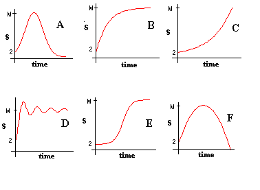
Students consider the possibilities of the graph interpretation in relation to the given situation. The most realistic graphs are B and E; however, under specific circumstances, also the graph C may apply, as it shows the rumour spreading exponentially outside the school population. Graphs A and F are less likely because the rumour-aware students would forget the information too quickly, unless the x axis indicates time in days or years. The graph D is most improbable because it fluctuates violently, showing possible memory lapses of rumour recipients.
- After the graphs discussion, students try to think about the conditions or variables affecting the rate of rumour spread. I ask them to think of at least three significant variables, and the students usually come up with some of the following:
- How interesting or juicy the rumour is.
- The starting time of the rumourspread, i.e. during the lesson or break.
- Whether the rumour spreads just by the wordof-mouth or the electronic means and social media are employed as well.
- The type of school and the way students interact, i.e. whether they have lessons just with their groups or classes, or whether they mix a lot.
- The last task is to prepare a short presentation of the chosen graph and explain to the audience what the graph is composed of and which tendencies can be seen. During this activity, students practise functional language for a graph description.
Conclusion
I have been doing this activity for several terms and, in most cases, it was a successful and enjoyable experience both for the students and their teacher. I believe it was mainly because this is a less controlled exercise involving speaking in groups with the aim to consider the authentic, real-life situation, that can be modelled using a graph. Students like it as they can be creative, practise functional language and try to address a concrete problem.
Please check the Pilgrims f2f courses at Pilgrims website.
Please check the Pilgrims online courses at Pilgrims website.
Introduction to Word and Sentence Stress
Antonín Zita, the Czech RepublicProblem-solving Using Visuals: The Spread of a Rumour
Eva Coupková, the Czech RepublicRole-play in Biochemistry Debate
Daniela Dlabolová, the Czech RepublicThe Creativity Group